
Levelplay

Color Palette, Character Illustration, and Visual Language
The foundation of our brand’s look is a high-contrast, high-energy graphic style. We use a striking color palette of deep black and a vibrant, warm orange to create an instant sense of power and excitement. Our design features a unique, stylized character illustration that gives the brand a distinctive, almost graphic-novel personality. This isn’t just a logo; it’s a signature style that flows through every element, from large hero images to subtle repeating patterns, ensuring our brand is always instantly recognizable and unforgettable.

User-Friendly Interface and Navigational Design
We believe that a great user experience should feel effortless. Our user interface is built on a dark, sleek background that’s easy on the eyes and makes all the content truly pop. We’ve organized our information into clean, modular blocks, which makes it simple to navigate and find exactly what you’re looking for. The use of bold headlines and a clear visual hierarchy guides your eye smoothly through the page, making your journey of discovery both intuitive and enjoyable. It’s a design that’s as intelligent and well-thought-out as our products.


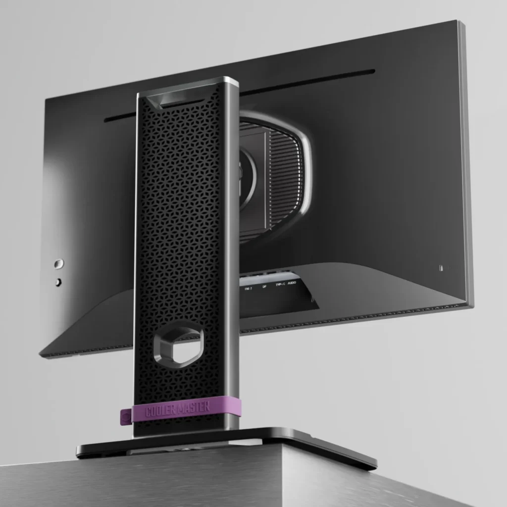
High-Quality Product Photography and Visual Presentation
Every product we create is a work of art, and our renderings are designed to showcase them in the most dramatic way possible. We photograph and render our products against a clean black background, allowing them to take center stage and shine on their own. The lighting is carefully crafted to be dynamic and almost cinematic, highlighting every detail, from the vibrant RGB glow of a fan to the subtle texture of a bottle. This approach doesn’t just show you what our products look like—it gives you a sense of their power, quality, and stunning design.


Shake Up Creativity
MEET THE TEAM BEHIND SHAKES DESIGN