Cooler Master x Street Fighter

Colors That Play to Win
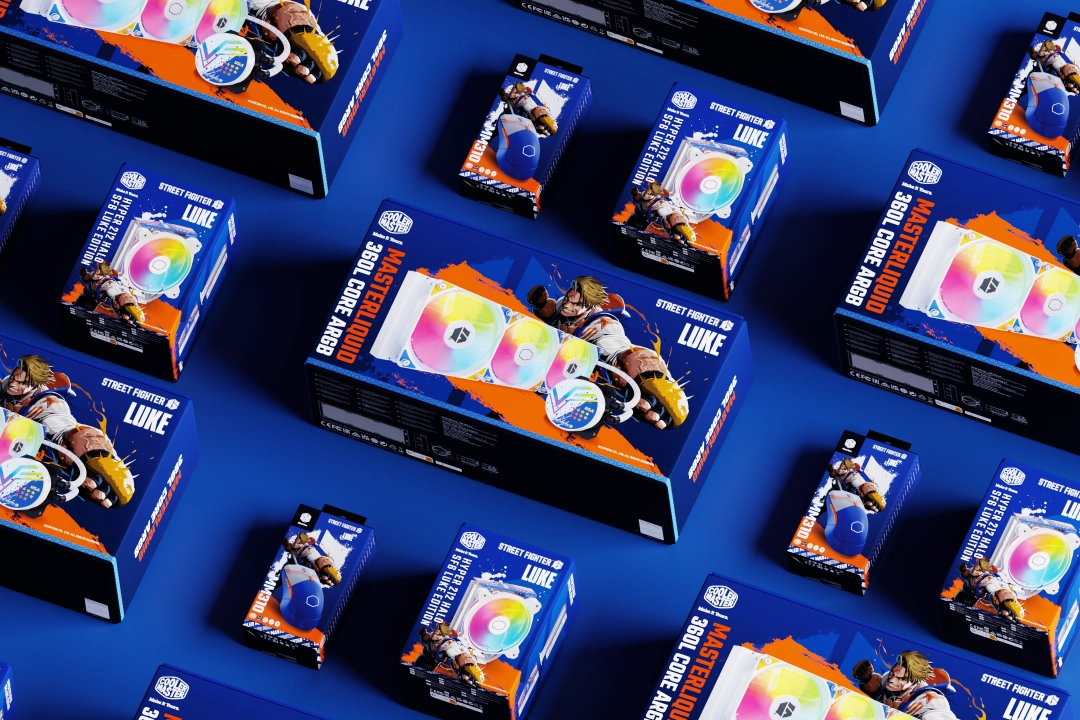
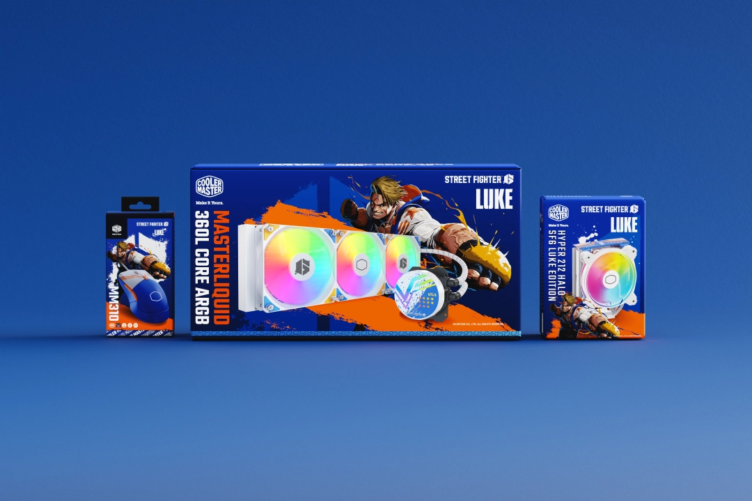
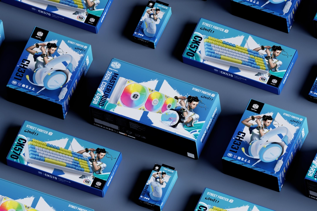
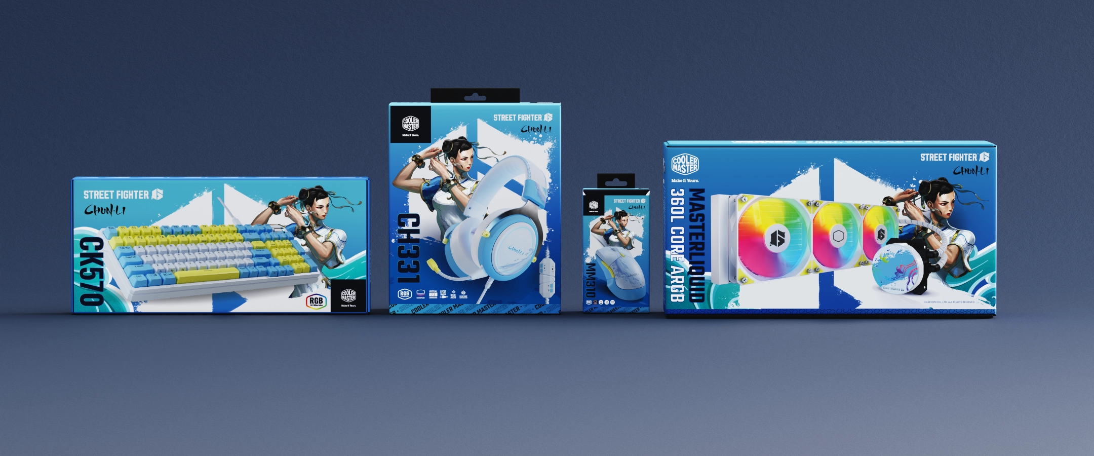
Our graphic style is all about striking a chord with bold, energetic visuals. We’ve chosen a fantastic palette of deep blues and crisp whites, making everything feel fresh and modern. What truly stands out is the awesome rainbow gradient on the disc – it’s a burst of color that feels alive and unique! Paired with the dynamic illustration of the player in action and our clean, punchy typography, this design immediately communicates excitement and cutting-edge style. It’s a visual language that’s made to stand out and invite you into the action.
Spotlight on the Superb
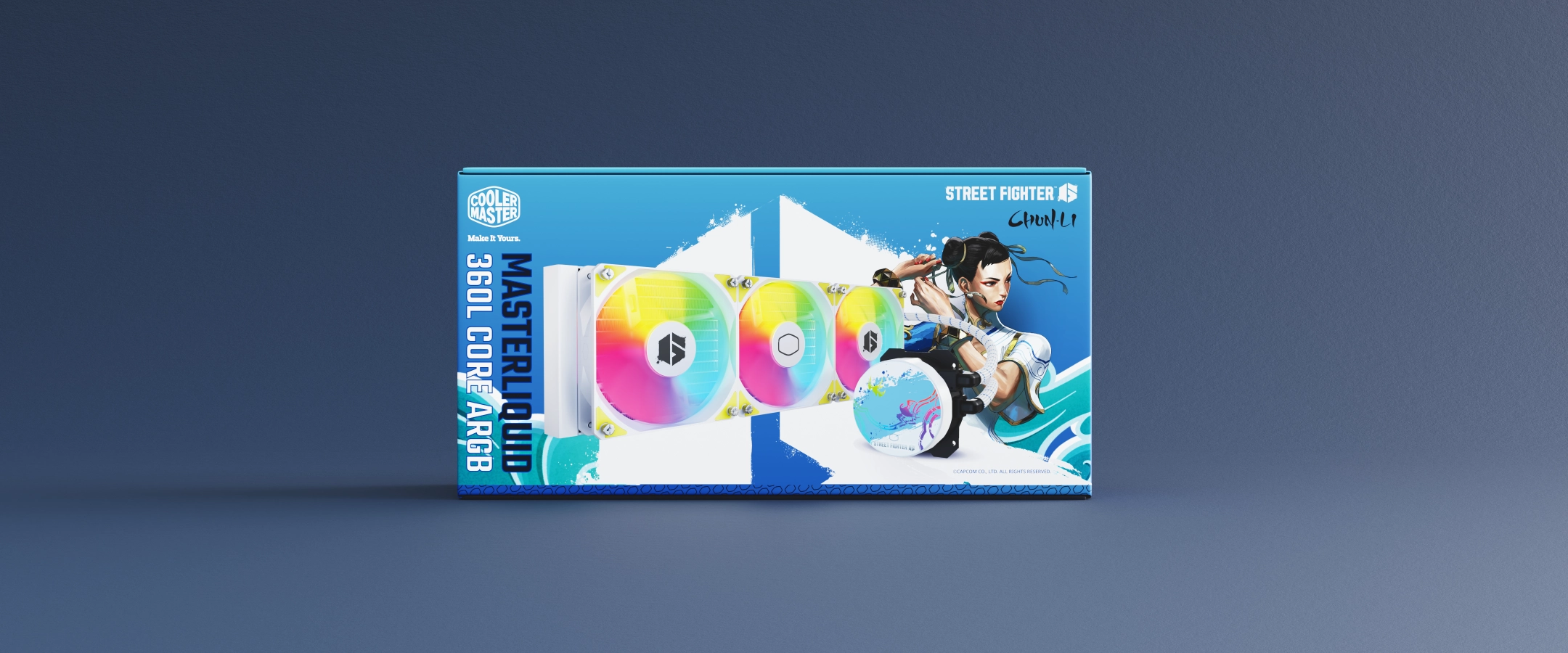
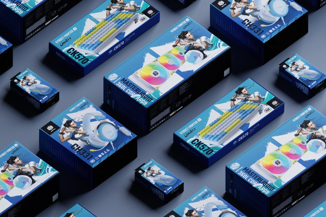
Presenting our product in the best possible light was key! Our product renderings showcase the packaging with incredible clarity and vibrancy. We use clean, bright blue backgrounds that make the product pop and highlight every detail, from the glossy finish to the intricate artwork. The lighting is carefully set to perfectly illuminate the colors and textures, making the box and disc look incredibly sharp and appealing. Whether it’s a single shot or a vibrant collection of boxes, these renderings ensure that our product always looks premium, inviting, and ready for you to enjoy!
Shake Up Creativity
MEET THE TEAM BEHIND SHAKES DESIGN


