TWIN LOTUS BIRD’S NEST BEVERAGE PACKAGING
Crafting A Premium International Identity.
In 2017, we embarked on a journey to introduce the purest taste of nature to China. Our quest began with a realization – our existing brand content couldn’t rival cheaper Chinese alternatives. It was time for a transformation. Hand in hand with our Chinese team, we delved deep into the essence of Twin Lotus Bird’s Nest. What sets it apart? It’s the assurance of safe origins, a legacy steeped in natural products, and a texture and flavor that’s truly exceptional.
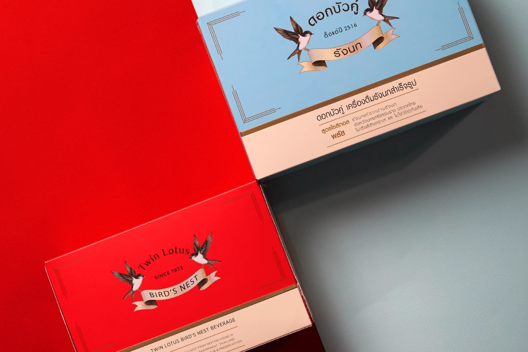
With these precious values in mind, our dedicated team set to work crafting a brand that would stand tall among the rest. From the initial spark of inspiration to the final brushstroke, every detail was meticulously honed to perfection.
Join us on this journey and discover the embodiment of nature’s finest, the Twin Lotus Bird’s Nest. Embrace the taste of tradition, quality, and authenticity like never before.

THE BOTTLE: TRADITIONAL MEETS MODERNITY
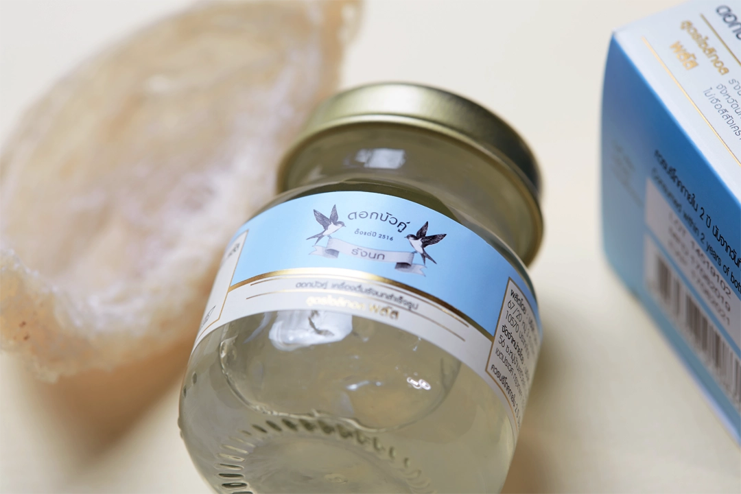
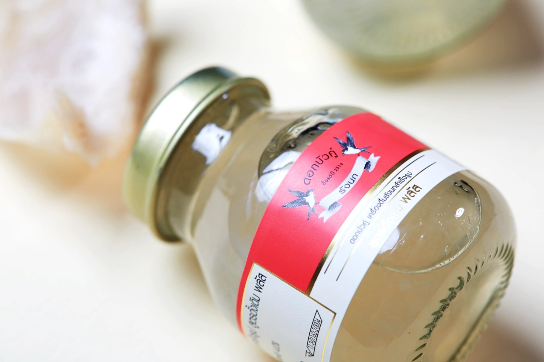
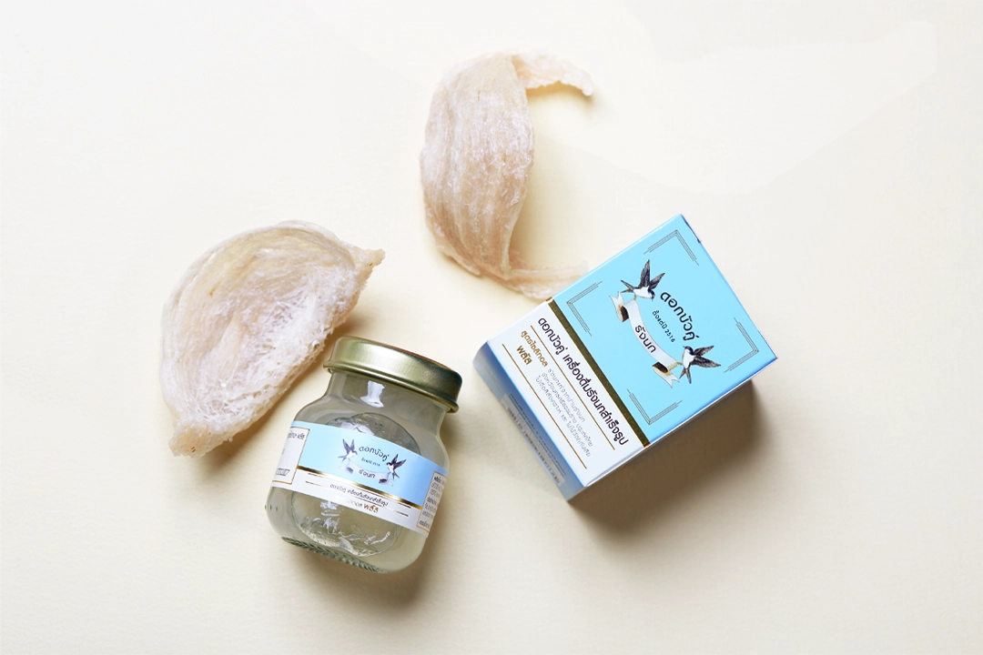
Having previously finished the brand’s new assets and “Twin Birds” logo we quickly figured that the key element for the bird’s nest beverage identity wasn’t so much its label but its bottle. After several prototypes we came up with a beautiful bottle shape, inspired by traditional Asian vials, with a soft rounded body and a defined neck for easy holding and drinking.
More Information
Shake Up Creativity
MEET THE TEAM BEHIND SHAKES DESIGN


