KBS SUGAR
The FIRST Refined Sugar & 60 Years Celebration
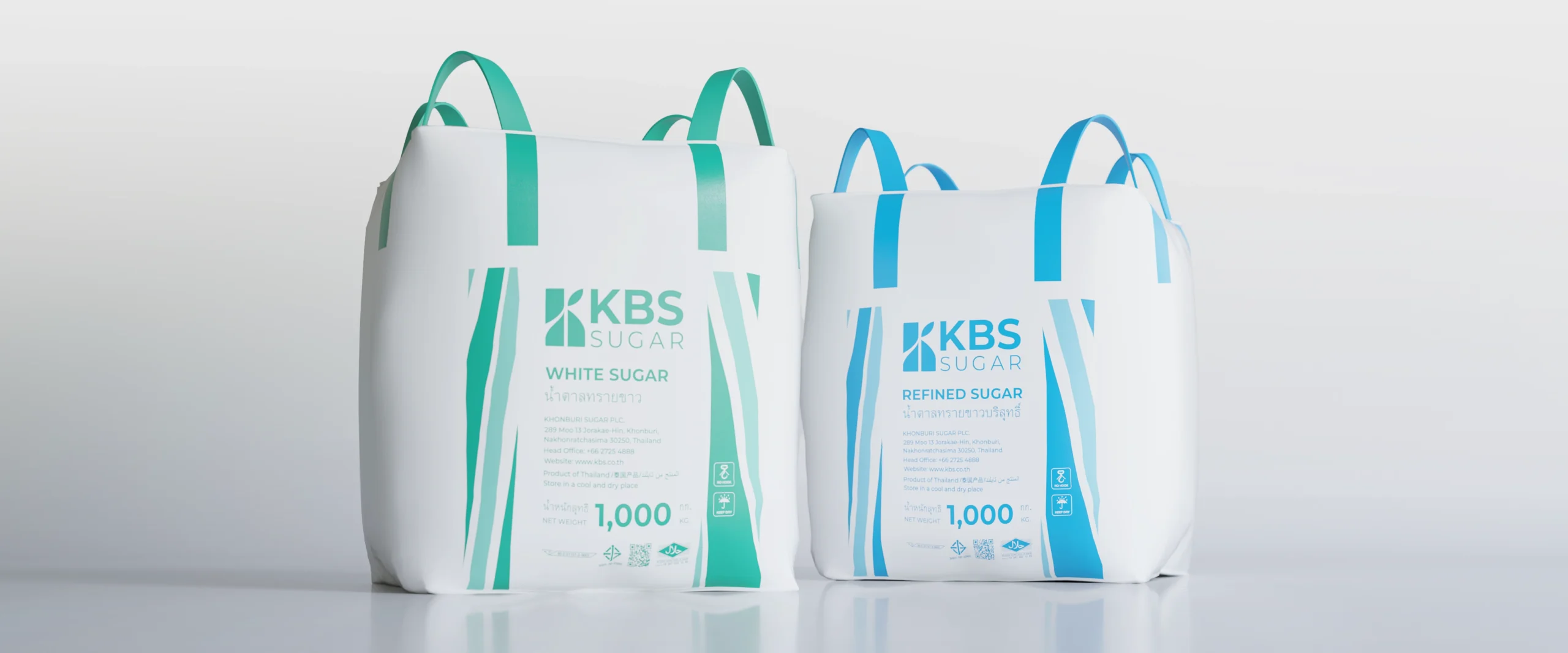
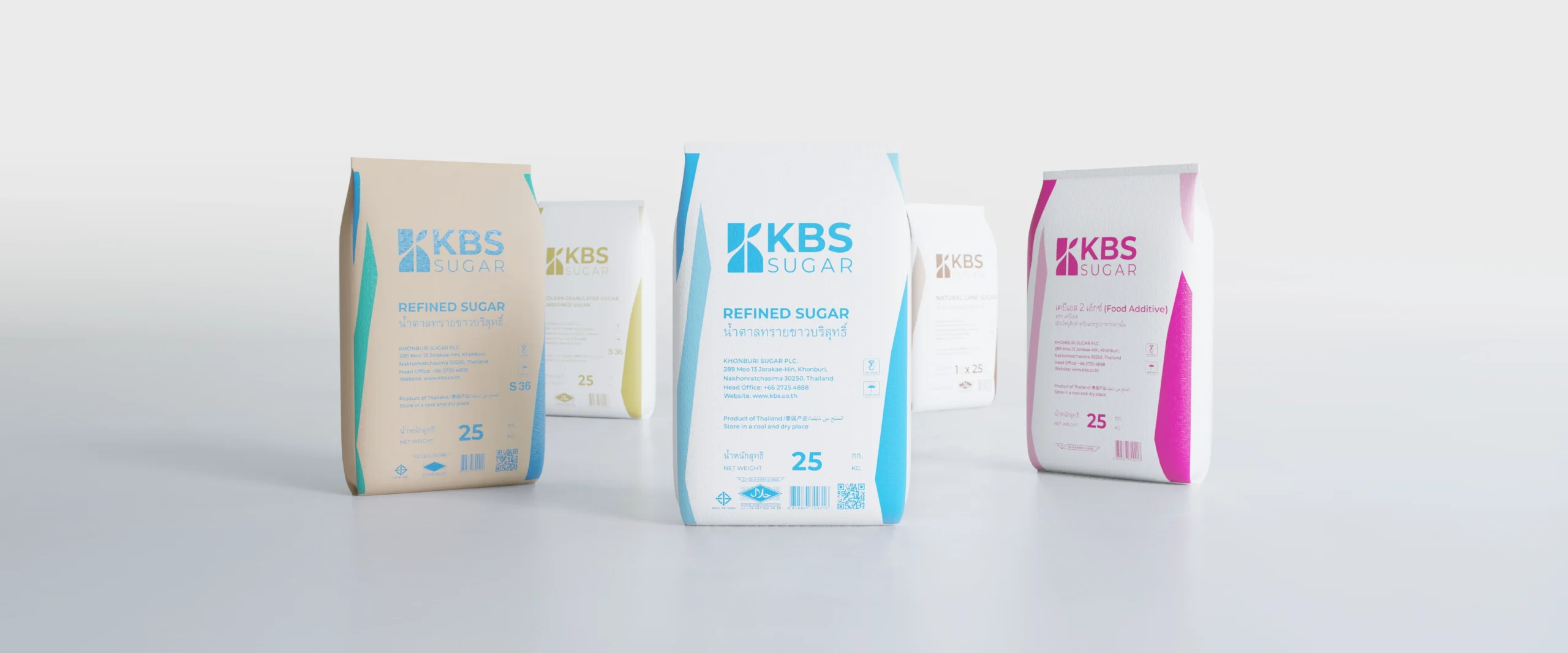
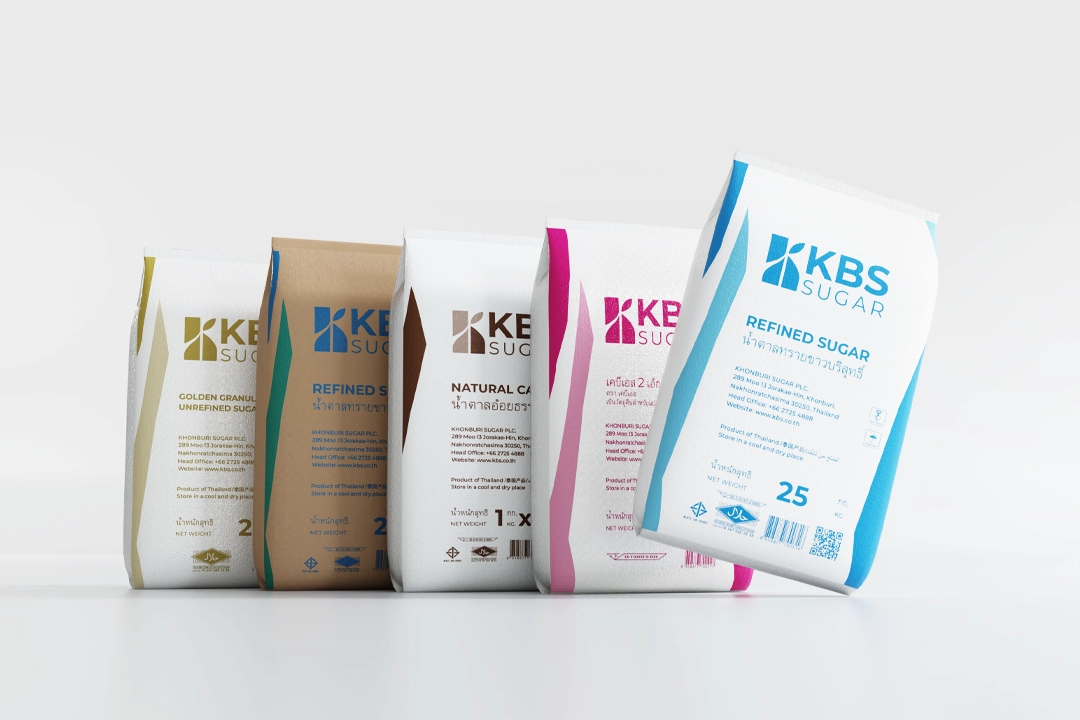
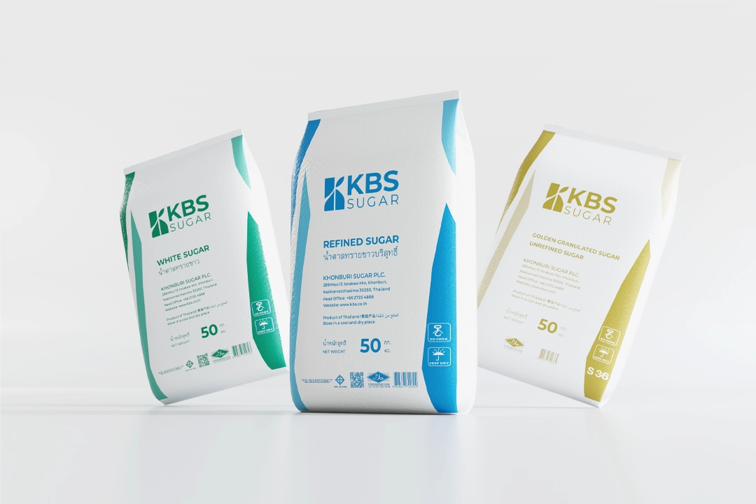
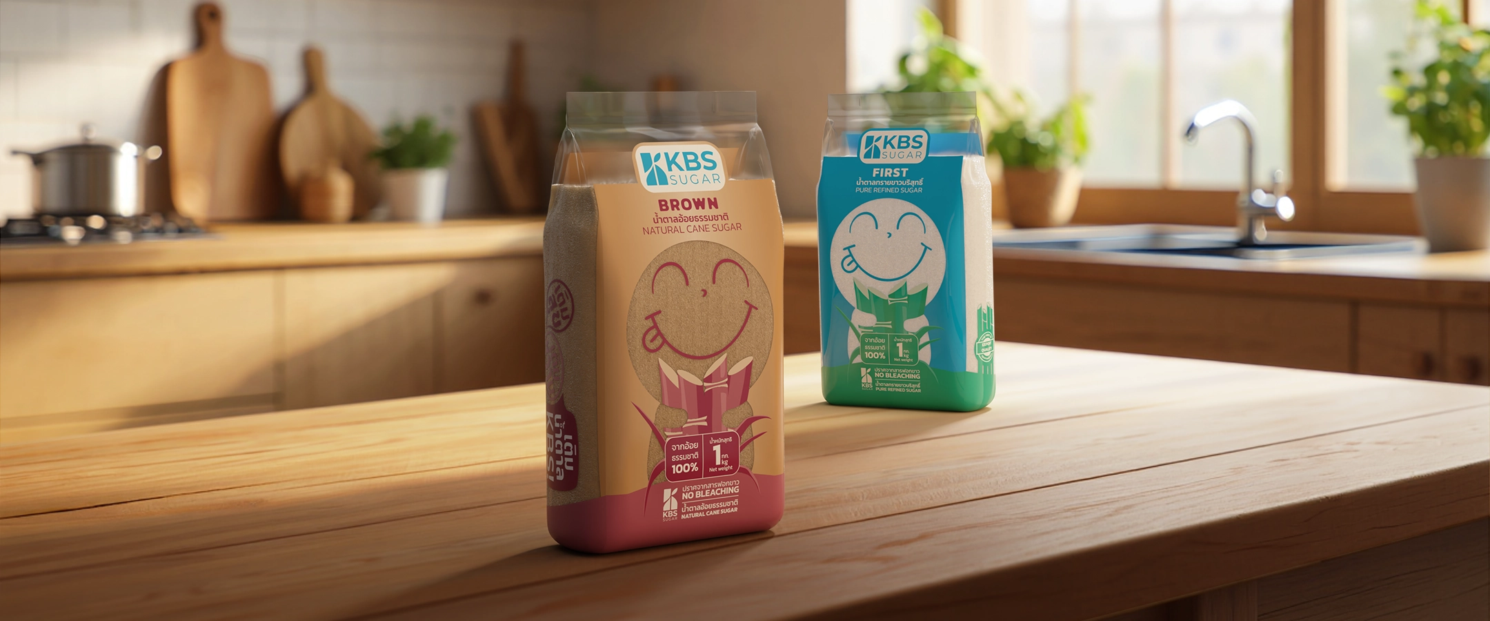
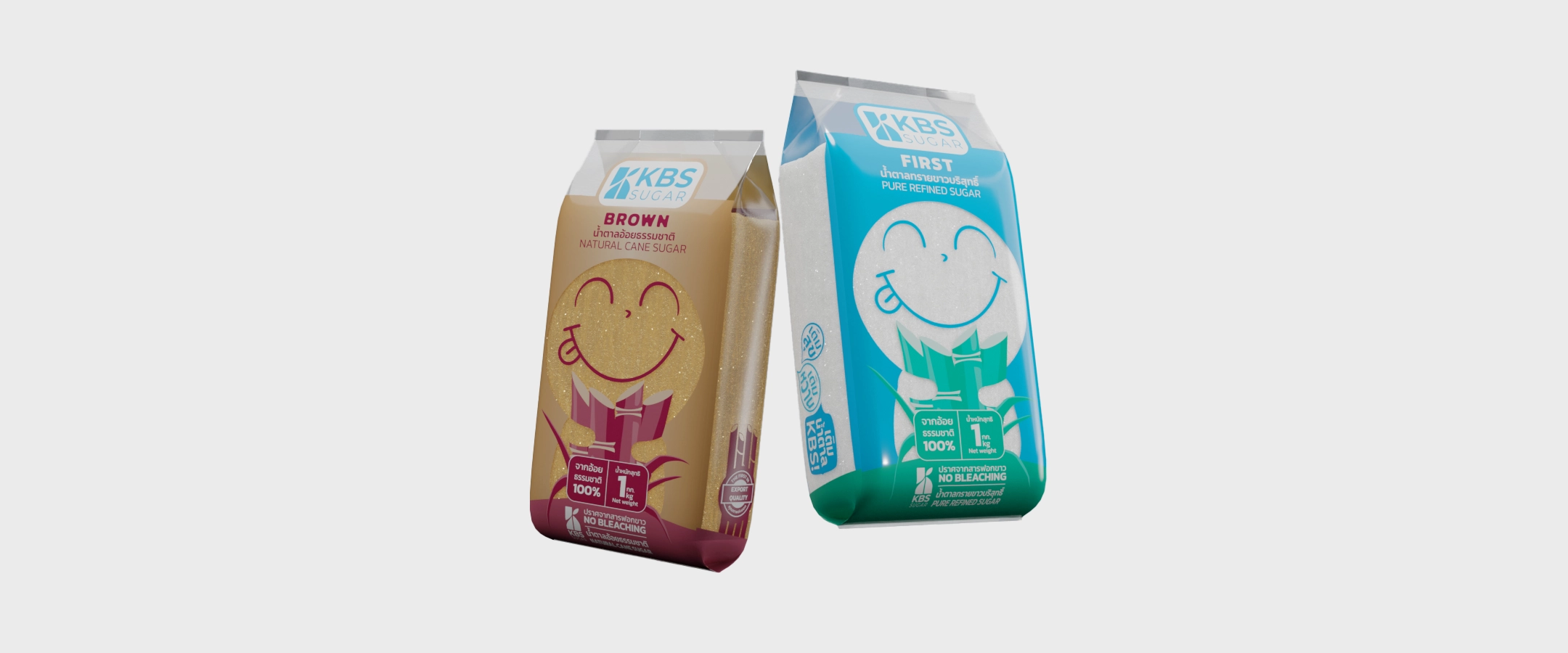
Our packaging design is a testament to the belief that a premium product deserves a premium look. We’ve embraced a clean, minimalist aesthetic with a foundation of pure white, symbolizing the pristine quality of our sugar. This canvas is accented with a carefully selected palette of soft, contemporary colors—gentle green, tranquil blue, and warm brown—each chosen to clearly differentiate our product varieties. The result is a unified and sophisticated line that conveys purity, quality, and a modern sensibility, reflecting the elevated nature of what’s inside.
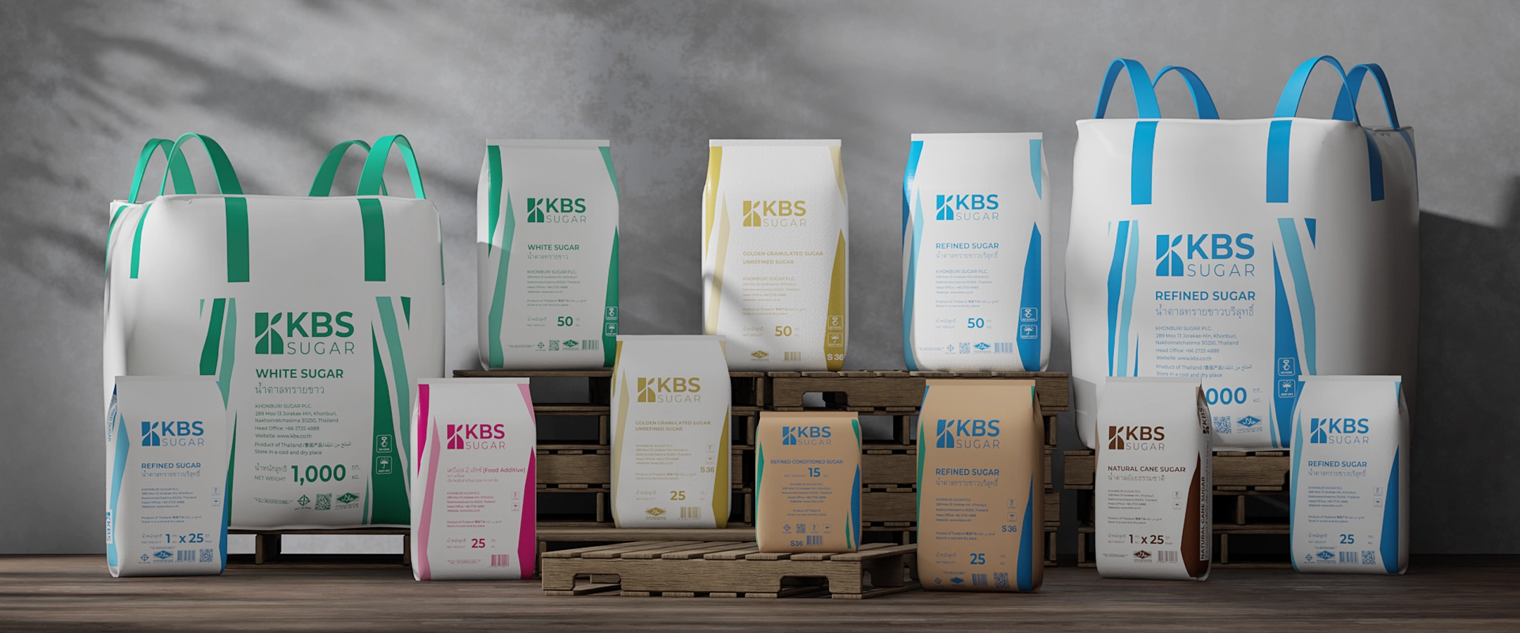
THOUGHTFUL DESIGN FOR A SUPERIOR EXPERIENCE
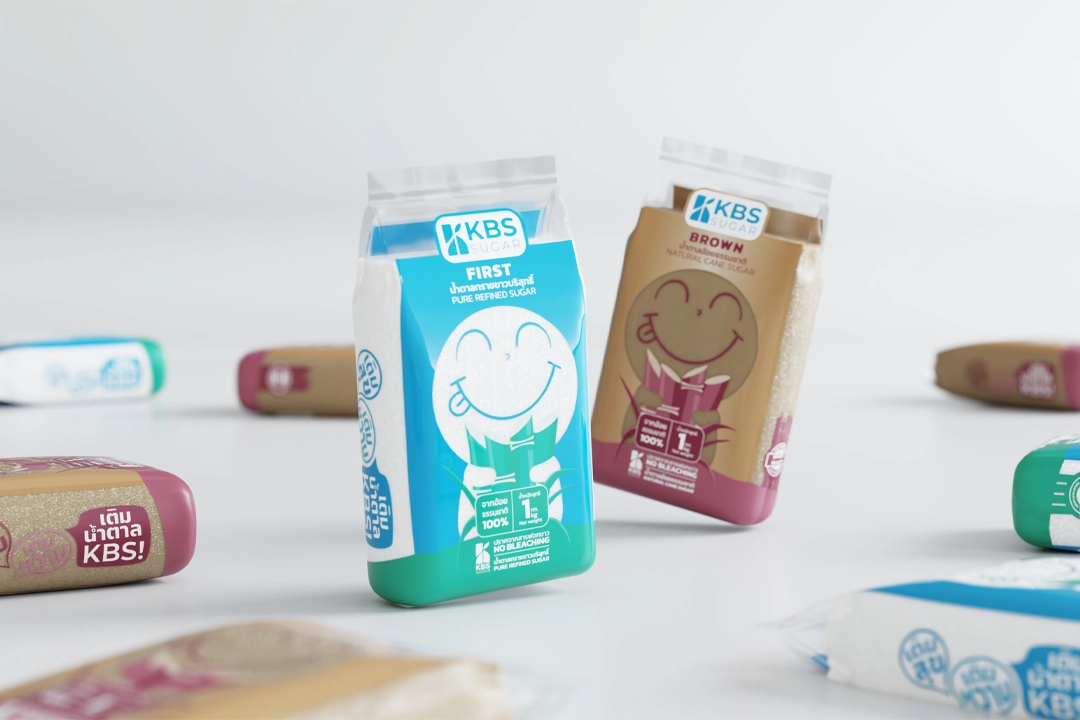
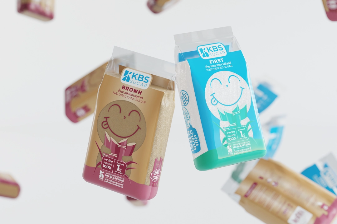
Beyond its visual appeal, our packaging is designed with a focus on practical elegance. The larger bags are equipped with robust, integrated handles for effortless transport, while the smaller pouches are engineered to stand independently for convenient handling and display. To infuse a sense of character and joy, each variant features a unique, friendly illustration. These charming, stylized graphics—from a cheerful heart to a playful, smiling face—are not merely decorative; they serve to create an immediate, positive connection with the product, making each selection a delightful discovery.
THE ART OF ESSENTIAL INGREDIENTS
This new packaging redefines the visual identity of a staple ingredient, transforming it from a simple commodity into an object of considered design. The harmonious blend of clean typography, a refined color scheme, and engaging illustrations elevates the product’s entire presentation. This is more than just a container; it is a statement of our dedication to craftsmanship and quality. Each bag is a reflection of our commitment to providing not just a superior ingredient, but also a superior experience, from the moment it is seen to the moment it is used.
Shake Up Creativity
MEET THE TEAM BEHIND SHAKES DESIGN


